Transaction Overview
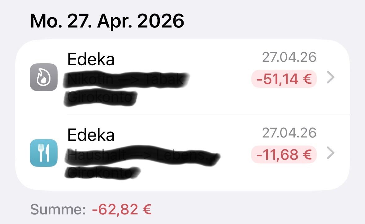
I find the transaction list quite cluttered, as the dates are very small. It is very difficult to clearly see what was paid on any given day. It would be much clearer if the transactions were grouped by day, with the date displayed above each group (see image). Regarding the #Tags, it would be nice to be able to choose different colors.
Status: Planned
Log in to comment and vote
No comments yet
Be the first to share your thoughts.